Introduction
The difference between Instagram data and Instagram insight is presentation. Raw numbers from a dashboard tell a story only if they are organized, contextualized, and communicated in a way that the audience of the report can understand and act on. A beautifully structured report with clear visualizations and well-written narrative sections transforms the same underlying data from a collection of figures into a coherent picture of what is happening, why it matters, and what should happen next.
This guide provides a complete social media report template that works across different report audiences, from clients and executives to internal teams and stakeholders. It covers the specific sections every effective Instagram report should include, the design principles that make data readable and compelling, and the presentation approaches that communicate value clearly regardless of the audience's technical familiarity with social media metrics.Instapv
This guide builds on the client reporting guide from Day 20 by providing a more detailed and generalizable template that extends beyond client-specific reporting to all Instagram data presentation contexts.
Who Uses Social Media Reports and What They Need
Before building a template, understanding the different audiences that Instagram reports serve and what each needs from the report prevents the common mistake of creating one-size-fits-all reports that serve no audience particularly well.
Executive and Leadership Reports
Executives and business leaders need to understand Instagram's contribution to business objectives without needing to understand the mechanics of social media performance in detail. They need a concise narrative that connects Instagram activity to outcomes they care about: revenue, brand awareness, audience growth, and competitive position.
For this audience, the executive summary is the most important section, and every metric presented should be accompanied by plain-language context explaining what it means for the business rather than assuming familiarity with social media benchmarks.Read blog
Client Reports for Agencies and Freelancers
As covered in Day 20's client reporting guide, clients need to see both that work is being done and that it is producing results. They typically have more social media familiarity than senior executives but still need metrics contextualized and interpreted rather than presented as raw data.
For this audience, visual trend displays, period-over-period comparisons, and competitive context are particularly valuable because they make performance judgment possible without requiring deep analytical expertise.
Internal Team Reports
Social media and marketing teams using reports for their own strategic planning need more analytical depth than executive or client reports typically provide. They can interpret more technical metrics and benefit from detailed breakdowns that identify specific opportunities and problems at a level of granularity that executive reports deliberately omit.
For this audience, content performance breakdowns, format comparisons, posting time analysis, and hypothesis-based interpretive sections add value that would overwhelm a less technical audience.
Stakeholder and Investor Reports
For businesses where Instagram is a significant channel and reporting to investors or board members is relevant, reports need to connect social media performance to business fundamentals in ways that matter to financial stakeholders: customer acquisition, brand value, market share signals, and return on marketing investment.
The Complete Report Template Structure
Cover Page
A professional cover page establishes the report's identity and makes it easy to file and reference later. Include the brand or account name, the reporting period clearly stated, the report type such as Monthly Instagram Performance Report, the date of preparation, and if applicable, the name of the person or agency preparing the report.
For client reports specifically, including both the client's branding and the agency's branding on the cover page reinforces the professional relationship while making the report clearly identifiable to the client.
Table of Contents
For reports exceeding four pages, a table of contents with page references allows readers to navigate directly to sections most relevant to their specific needs rather than reading sequentially. Executive readers typically go directly to the executive summary and business impact sections. Analytics-focused readers may navigate directly to the content performance section.
Executive Summary
As covered in Day 20's client reporting guide, the executive summary is the most-read section of any report and the section most commonly done inadequately.
An effective executive summary is three to five sentences maximum, written in plain language, covering:
What happened during the period in broad terms. Whether performance improved, held steady, or declined relative to the previous period and to established goals. What the primary driver of the period's performance was. What the focus and expected outcome of the next period's strategy is.
Everything in the executive summary should be substantiated by data in the sections that follow. The summary is the conclusion of the report written at the top, not a separate document that exists independently of the data.
Period Performance Snapshot
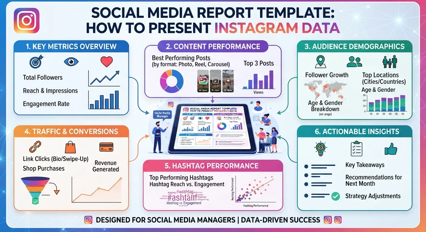
A visual one-page summary of the key metrics for the reporting period provides the at-a-glance view that many report readers want before engaging with detailed sections. This snapshot should include between five and eight of the most important metrics, each presented as a large number with a simple trend indicator showing whether the figure is up, down, or stable compared to the previous period.
Useful metrics for a period performance snapshot include: follower count with net change, engagement rate with trend arrow, average reach per post with trend, total impressions for the period, Story completion rate with trend, link clicks with trend, and if available, any primary business conversion metric.
The design of this section should prioritize immediate visual comprehension over data density. Large, clear numbers with simple color-coded trend indicators communicate faster than tables or complex charts.
Audience Growth Section
The audience growth section provides detailed context on how the account's following changed during the reporting period.
Include the follower count at the start and end of the period, net follower change as an absolute number and as a growth rate percentage, a line chart showing follower count over the period if multi-week data is available, comparison of this period's growth rate against the previous period's rate, and if available, the profile visit to follower conversion rate as covered in Day 18's business metrics guide.
Brief interpretive text below each visual should explain what the data shows in plain language. Avoid assuming the reader will interpret charts without guidance.
Content Performance Section
The content performance section is typically the most detailed section of the report and covers how the content published during the period performed across different metrics.
Start with the overall average engagement rate for the period and its comparison to the previous period and to any established target. Follow with a format performance breakdown showing average engagement rate by content format, which as covered in Day 12's format comparison guide is one of the most actionable analytical breakdowns available for content strategy.
Feature the three to five top-performing posts from the period with their visual thumbnails where possible, their key metrics, and a one-sentence explanation of what drove their strong performance. As covered in Day 20's client reporting guide, including underperforming content analysis alongside top performance provides the analytical honesty that builds long-term trust with report audiences.
Include average save rate as a separate metric if the report audience understands its significance, or incorporate it into the top performer analysis with a brief explanation of why saves matter for algorithmic distribution.
Stories Performance Section
For accounts with active Stories strategies, a dedicated section covering Story metrics communicates the channel's performance separately from feed content.
Include average Story views for the period, Story completion rate trend, any notable Story formats or topics that generated above-average engagement, and a brief assessment of whether the Stories strategy is strengthening or weakening audience relationship based on the metrics pattern.
Reels and Video Performance Section
For accounts publishing Reels, a dedicated section covering video-specific metrics provides the most relevant context for this format's distinct performance characteristics.
Include average Reel views, average completion rate where available, the proportion of Reel reach coming from non-followers where available through Insights, and identification of the Reels that generated the strongest non-follower discovery during the period.
Audience Insights Section
For reports to audiences who need to understand who is following the account, an audience insights section covering demographic and behavioral data provides context that pure performance metrics cannot supply.
Include the top audience demographic breakdowns available through Instagram Insights: age range distribution, gender split, and top geographic locations. Include a brief note about how the current audience composition compares to the target audience profile and whether any adjustment in content or targeting approach is warranted.
Competitive Context Section
As covered in Day 20's client reporting guide, competitive context transforms absolute performance figures into relative performance assessments that reveal whether the account is leading, matching, or trailing its competitive set.
Using InstaPV to gather follower growth and engagement rate data for two to four comparable competitor accounts as covered throughout this series, present a simple comparison showing the reported account's key metrics alongside the competitive set. A clear visual comparison, whether a bar chart or a simple table, makes the relative position immediately apparent.
Include a brief interpretive note about what the competitive comparison reveals and whether any specific competitive insight should influence the next period's strategy.
Business Impact Section
The business impact section connects Instagram activity to the downstream business outcomes that justify the investment in the channel.
Include website traffic from Instagram with quality indicators as covered in Day 18's business metrics guide, any conversion metrics tracked for Instagram-sourced traffic, link click data from the bio link and any Story link stickers, and if applicable, any revenue or lead generation figures attributable to Instagram activity through the tracking methods covered in Day 18.
For accounts early in their Instagram strategy where direct business attribution is limited, this section should acknowledge the limitation honestly while presenting the best available proxy metrics and explaining the expected timeline for direct business impact to become measurable.
Forward Strategy Section
The forward strategy section translates the preceding analysis into specific planned actions for the next period.
Structure this section around three to five specific strategy decisions, each presented as:
The observation from the data that informed the decision, the specific change or emphasis being implemented, and the expected outcome or metric improvement that will indicate the change is working.
This structure demonstrates analytical rigor by connecting strategy decisions to data evidence rather than presenting changes as arbitrary decisions. It also creates accountability by establishing measurable expected outcomes that can be evaluated in the next reporting cycle.
Design Principles for Report Readability
Visual Hierarchy
The most important information in any section should be visually prominent. Use size, weight, and placement to communicate what matters most. A key metric should be larger than its supporting context. A trend arrow should be immediately visible alongside the number it describes. Section headings should clearly delineate where one topic ends and another begins.
Color Use
Color in reports should encode meaning rather than decoration. Green for positive trends, red for negative trends, and neutral colors for stable or baseline figures creates an immediately intuitive color language that readers grasp without explanation. As covered in Day 14's brand strategy sections, consistency in color meaning across all visualizations prevents the confusion that inconsistent color use creates.
Chart Selection
Choosing the right chart type for each data type improves comprehension significantly. Line charts work best for trends over time, showing how a metric has changed across the reporting period. Bar charts work best for comparisons between categories, such as engagement rate by content format. Single large numbers with trend indicators work best for period-over-period comparisons of key metrics. Tables work best when precise numbers matter more than visual pattern recognition.
Pie charts are rarely the best choice for any Instagram data presentation because the proportional comparisons they are designed to show are almost always better communicated through bar charts with labeled values.
White Space
Adequate white space between sections, around visualizations, and within text blocks makes reports significantly more readable than densely packed layouts that try to maximize information density per page. As a practical guideline, if a report page feels crowded, removing one element and giving the remaining elements more space almost always improves the overall communication effectiveness.
Report Length by Audience
Different report audiences need different levels of detail, which should be reflected in report length.
Executive and leadership reports should typically be one to two pages maximum. Every additional page increases the probability that the key messages will be missed or that the report will not be read fully.
Client reports for agencies and freelancers as covered in Day 20 typically run four to eight pages, providing enough detail to demonstrate thoroughness while remaining focused on the metrics most relevant to the client relationship.
Internal team reports can run eight to fifteen pages for detailed monthly analysis, since the team audience benefits from the granularity that would overwhelm other audiences.
Investor and stakeholder reports should be calibrated to the specific audience's familiarity with the business and their need for detail, but typically err toward conciseness over comprehensiveness.
Presentation vs Distribution
For reports that will be presented verbally rather than only distributed as documents, the design and structure considerations differ from pure document reports.
Presentation reports benefit from more visual content and less text, since the presenter's verbal narrative will carry much of the interpretive content that text sections handle in a distributed document. Each slide or page in a presentation report should support one clear idea rather than multiple ideas competing for attention.
For distributed documents that will be read without verbal accompaniment, more explanatory text is appropriate since the document must communicate the interpretation that would otherwise be provided by the presenter.
Many reporting situations benefit from both: a detailed distributed document that stands alone as a complete record, and a condensed presentation version used for live review sessions that highlights the most important findings and decisions..
-
How InstaPV Helps Recruiters Research Candidate Instagram Profiles
-
How to View Archived Instagram Posts and Stories (2026 Guide)
-
Instagram Collaboration Features: How They Work and What to Track
Frequently Asked Questions
Q: Should I use a standard template every month or customize for each reporting period?
Using a consistent template structure is strongly recommended for ongoing reporting as covered in Day 5's PDF reporting guide and Day 20's client reporting guide. Consistent structure makes reports faster to produce, easier to compare across periods, and more familiar to regular readers who develop navigation habits with a known structure. The content within the template sections changes each period while the structure remains stable.
Q: What software should I use to create the report?
The specific tool matters less than the output quality and the efficiency of your production workflow. Common options include presentation software for visual-first reports, document editors for text-heavy reports, and design tools for more polished visual presentations. The most sustainable choice is whichever tool you can use efficiently enough to produce high-quality reports consistently within your available time.
Q: How do I handle months where performance was poor across most metrics?
As covered in Day 20's client reporting guide, honest reporting of difficult periods, combined with clear analysis of what drove the poor performance and a specific plan for addressing it, consistently produces better long-term client and stakeholder relationships than reports that minimize or omit negative results. A difficult month reported honestly with clear strategic response builds significantly more trust than a pattern of selectively positive reporting.
Q: Can I include InstaPV data in client reports?
Yes. InstaPV's publicly available analytics data for competitor accounts can be included in the competitive context section of client reports, with appropriate attribution noting that competitive data reflects publicly available information accessed through InstaPV. This is both transparent and professionally appropriate.
Conclusion
A well-designed social media report template does not just present data. It tells a coherent story about what is happening with the account, why it matters for the business, what the most important patterns are, and what specifically will be done next to improve results. The template structure in this guide provides the organizational framework for that story, while the design principles ensure the story is communicated as clearly and compellingly as the underlying data warrants.
Building and refining a template over time, incorporating feedback from report audiences and learning from what communicates most effectively, produces progressively better reports that serve their audiences more effectively with each iteration.
Access competitive context data for your Instagram reports on InstaPV →